Designing the KST Membership Experience

Role: Lead Researcher / Time Frame: 2 Months
Group Members: Myself, Shalini Rao, Alex Tsai, Phipson Lee
Carnegie Mellon University

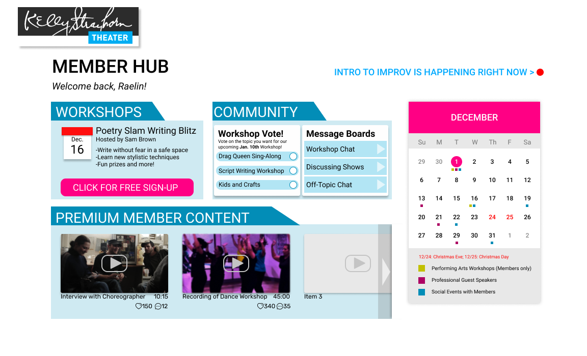
Final screen from prototype
Overview
Project Background
In fall of 2020 I began working on a research project with three other students to innovate new ways for the Kelly-Strayhorn Theater, a local Pittsburgh dance theater, to increase donations and grow their online presence during the pandemic. This was a two-month project for the User-Centered Research and Evaluation graduate course at Carnegie Mellon University.
Project Goals
Our group focused on increasing donations for the Kelly-Strayhorn theater. This client was a local dance theater who had grown their presence on Instagram during the pandemic but were still struggling to connect with their traditional audience or find ways to garner donations during the pandemic. We wanted to bolster their online presence with research-supported methods of increasing engagement and fostering community in a digital space.
Theater Masks
Group Dynamics
I had the privilege of working with a great group of peers for this project. As the purpose of the project and the class was to improve our user research skills we all contributed to the research and interpretation process, but I worked as the lead researcher. Other group members worked as project manager, lead designer, and technician. This project was my first experience using a group contract, which we compiled to make sure we were all committed to ensuring the project’s success.
Initial research
Competetive Analysis
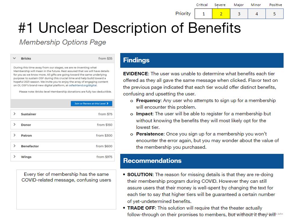
Screenshot of the useability findings from competetitor theater site
Our group began by examining artifacts from KST itself (sales numbers, website, etc.) and quickly moved on to see how other theater companies were handling their donation systems during the pandemic. We found many usability problems across several competitor websites. Among the most consistent findings was that users were very frustrated when membership or donation tier benefits were unclear. In order to drive donations, KST would have to re-think the perks they were offering to donors.
Contextual Inquiry
To better understand the problem space our group conducted in-depth contextual inquiries with four participants who had experience with donating to content creators online, or creating content themselves. These interviews lasted around 1 hour and featured the participant going through their Patreon, YouTube, Twitch, or other platforms where they find and support content creators. We gained many insights from these interviews as to what factors incentivized users to donate. I serve as the lead researcher by helping organize the schedule of these interviews and compile an executive summary document, shown on the left.
Major Findings

Beyond checking the content creator’s main creation page for content updates, participants also rely on social media and its algorithms to keep up to date. Participants interface with the recommendation systems implemented by the social media outlet of their choice, and participants have expressed that they are aware of this, and use it as a method of exploring and finding content they like. They find new creators based on collaborations with existing creators that they are subscribed to, or through the recommendation system that gives them similar content.
Content creators, on the other hand, try to take advantage of the importance of social media and disseminate their content through those platforms. Consistently, content creators have emphasized the importance of maintaining consistent content and branding across all social media platforms, and the need to share content across multiple social media outlets to improve discoverability. Methods include sharing highlight reels and content digests on Youtube and engaging with communities on Twitter.

Whether it be by intentional search or algorithmic suggestion, many people seek new content that is in some way related to content with which they are already familiar. People are more inclined to view (and thus donate to) creators who have collaborated with someone they know, creators involved in their areas of interest, and thumbnails/titles that promise the kind of content they are looking for.

Consistently, users expressed their desire to donate to content creators who “need it more”, and they avoid donating to large creators if they feel that their donation would have less value. Additionally, some participants stated that they hope their donations will help improve and aid creators who treat content creation as their primary source of income, whose content would benefit the larger community of viewers.

From our participants, some of the reasons behind donating include “rewarding those who create good content”, “contributing to a community they feel they belong to”, and “supporting a creator of good moral character”. Although the content itself is a main deciding factor, people do value the personalities behind the creators and the educational value that some creators may provide.

Users have also expressed interest in donating to specific content creators based on the perks and tiers that the creator provides for donors. For example, a user cited Twitch icons and “emojis” as key motivators for donating a certain amount to a content creator, because she felt a sense of community and liked the design of those icons. Additionally, users expressed the significance of personalized educational content such as one-on-one coaching sessions for video games based on the amount of money that the user donates to a content creator. Users also get exclusive access to content through their donations, which builds a sense of belonging and community.
Ideating a Solution
Speed Dating: Storyboards
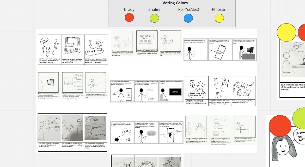
Now that we knew what drove users to donate we had to think of ways that KST could adopt these practices in their current business. We first decided on four main user needs and built three storyboards addressing a potential solution for each need. As lead researcher I organized interview sessions where we speed-dated all 12 storyboards to a participant who gave their reactions to the solution.
Initial Storyboards created through Miro
Storyboarding: Analysis and Revision
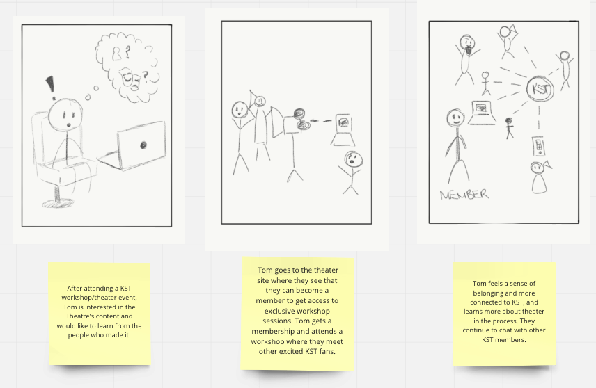
Finalized Storyboards
After testing our storyboards we found that there were several solutions which users liked the most. People responded very well to the idea of educational perks such as workshops that they could attend if they supported the theater. They also appreciated getting involved with a larger community of supporters. We created a final storyboard of a solution that combined some of these solutions, culminating in the ‘member hub’.
Prototyping a Membership Experience
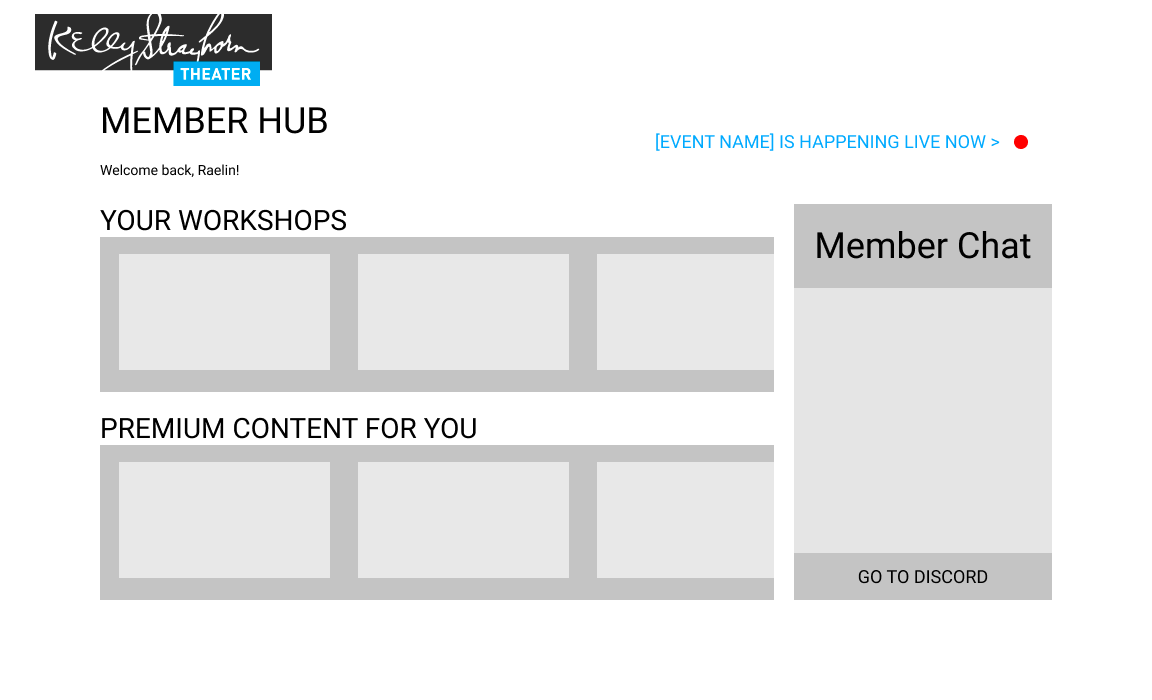
Lofi prototype page 1
Home Page
Lofi prototype page 2
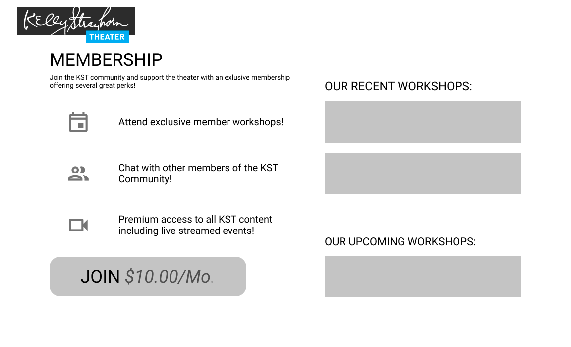
Membership Sales Page
Lofi prototype page 3
Membership Hub Page
Our prototype went through 3 rounds of user testing. In the first round we tested a variety of game concepts before narrowing down to one that incorporated the best of everything based on user feedback. We found that many users were confused by the rules we provided, making clarity a priority in future iterations. We also found that people were fatigued when reading too many articles during gameplay, so we put a focus on intermixing our main intervention with other game mechanics to make the users more comfortable when playing. In the second iteration, participants positively reacted to the social dynamic of the game, which we simulated by having group members play along as other players during the session. We wanted players to work together and vote on a piece of evidence that seemed the most suspicious, therefore getting the user practice at singling out unreliable sources of information. These mechanics were still being fleshed out and many users reported being confused by this process at this stage. Our final prototype was still operated via wizard-of-oz mechanics by group members behind the scenes, but were able to test pairs of participants in single sessions, showing us how true group dynamics would play out within the game. Our findings were overwhelmingly positive, with players working together to discuss the merits of their collected evidence and even using tactics that were directly applicable to the real world, such as researching the source of their evidence to find if it was reliable.
Think-Aloud Testing
I helped to draft a quick think-aloud protocol that we would administer in interview sessions while we had users interface with our prototype over Zoom. These users were all theater-goers who could be potentially interested in supporting a local theater. During our testing we found that these older, more traditional theater-goers felt unsure about using more casual outside technologies like discord for the purposes of a community chat. They also wanted to know more details about what each perk meant and how it applied to them personally. People really wanted more information in the membership hub about where and when events were happening, and how to access them if they were digital.
Hi-Fi Prototype
We went back to our prototype and improved the core functionality to reflect our findings from the think-aloud testing. In addition we added more polish to the prototype so that the client would be better able to see how it fit into their current website’s ecosystem. One change we made was a shift from a discord channel to a built-in discussion board on the site that was heavily simplified. We offloaded much of the community interaction to simple tasks like polls to pick the next workshop, making it feel more natural and connected to the rest of the hub. We also added dropdowns for every perk on the sales page to further elaborate on how the user would benefit from each perk shown. Finally we added a community calendar so that users would never be confused about the timing or nature of an upcoming event.
Hi-Fi Prototype Screens
Pitch to Client
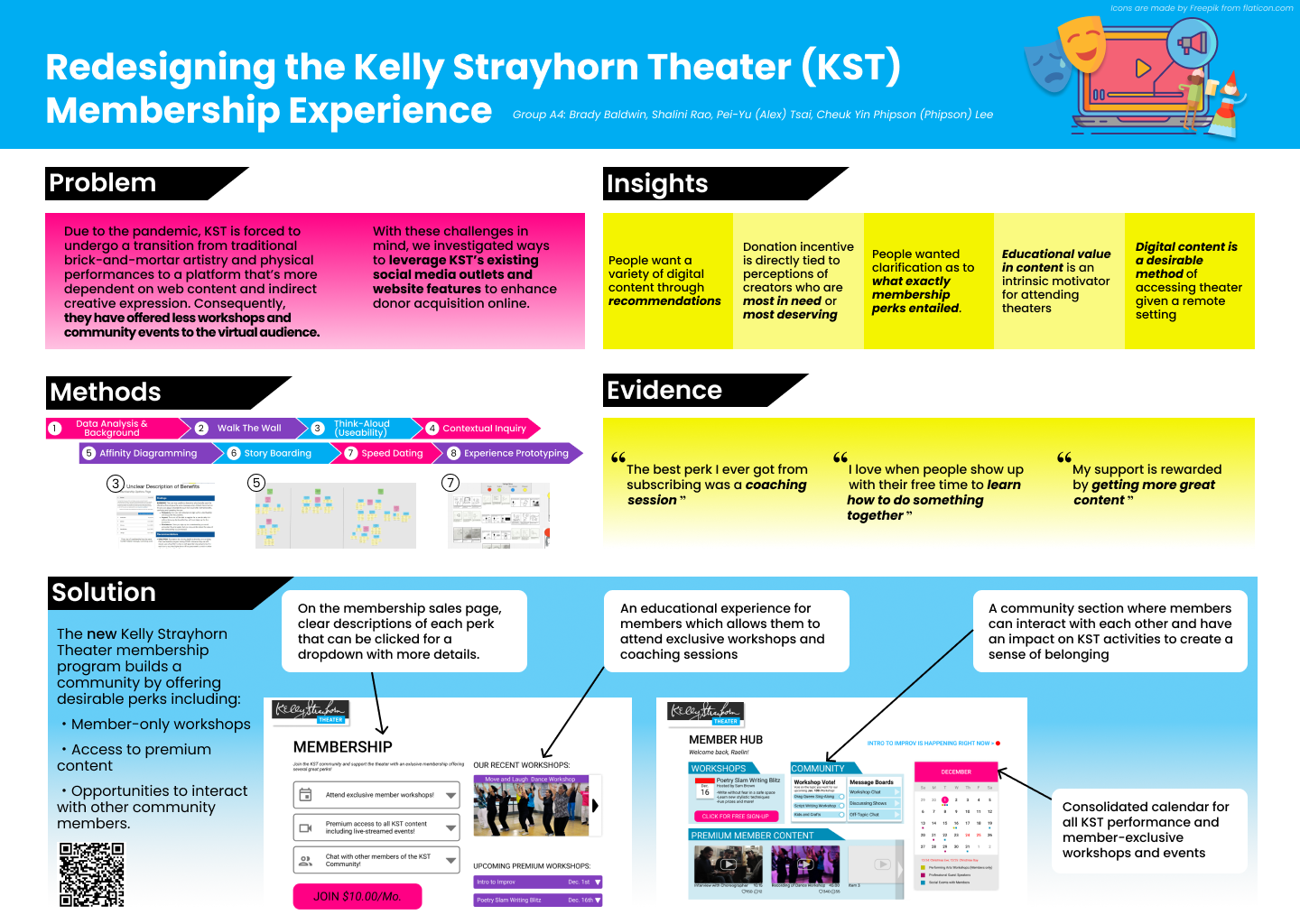
Final poster presented to client
Every group in the class was given the chance to present their findings to the KST management during an hour-long poster session. I helped my group by distilling our work into a few bite-sized chunks for the poster. I worked to pull our strongest quotes from users throughout our many phases of research and impart a few of our main findings as well. I also created a timeline of methods that gave the client a snapshot view of how we came to our final prototype. Every group member got a chance to present our findings with a quick elevator pitch. It was very gratifying to hear how excited the KST management were with our findings. They were actually in the process of redesigning their website and wanted to remain in contact to make sure they were incorporating new features in accordance with user needs that we uncovered in our research.

Link to the Figma Prototpye
Takeaways
Background used for virtual presentation of the intervention

Though I had experience with interviews before this project I had never conducted such thorough interviews over video call. I learned how to manage screen sharing, establish a rapport, and remain confident even through the digital divide.

I’ve previously had difficulty boiling down all of my ideas and findings into a digestible form. This project gave me the tools to create a concise but effective executive summary. Our group consistently produced high-quality deliverables that conveyed our core ideas well.
Created by Brady Baldwin, 2021